When one of your security patrol vehicles pulls into a parking lot, a residential community, or a corporate campus, something happens before one of your guards even steps out: people look, they assess (even subconsciously), and they form an opinion.
That opinion shapes whether a property manager calls your company for a quote, whether a homeowners association recommends you to a neighbor, or whether a facility director decides you look like the kind of operation they want representing their building.
Your vehicle is working whether you think about it or not. The question is whether it’s working for you.
Security Vehicle Graphic Design Strategies
Below, we’ll discuss some of the most vital considerations for security vehicle graphic design to ensure your fleet is sending the message you want it to.
What People See Before They See You
A security vehicle operates in public. It parks in front of businesses, drives through neighborhoods, and sits outside events. Every one of those moments is a brand impression, and none of them requires your team to say a word.
Research on first impressions consistently shows that people make snap judgments about professionalism, trustworthiness, and competence within seconds of encountering a brand.
For security companies, the stakes are higher than most.
Clients in this industry are hiring you to protect something they care about. They need to believe, before they ever speak to you, that you are capable and credible. A vehicle that looks clean, well-branded, and intentional communicates that the company behind it operates with the same attention to detail.
Faded logos, peeling decals, mismatched colors across the fleet, or a design that looks like it was assembled in a hurry sends a different message entirely. It suggests a company that cuts corners, doesn’t invest in its own image, and may not take the work seriously.
That might sound tough, but it’s the read that potential clients are making every time one of your vehicles rolls through their neighborhood or past their office building.
Read More: How Micro Servos Work in Electric Vehicles? A Beginner-Friendly Guide!
Visible vs. Professional
There’s a misconception in the security industry that visibility is the primary goal of vehicle graphics. Get the logo on the door, add a phone number, and call it done.
Of course, visibility matters. But professional presentation is what converts a sighting into a sales call.
Think about what a property manager sees when they spot a security vehicle outside a competitor’s building. If that vehicle looks sharp, the logo is clean, the color scheme is consistent, and the overall impression is polished, they’re more likely to wonder who the company is and look into your brand.
If the vehicle looks like an afterthought? Then they keep driving.
The security industry runs on trust and referrals. A professionally designed vehicle starts that trust conversation before your sales team ever picks up the phone.
It does the work of introduction, positioning, and differentiation all at once, without anyone having to say a word.
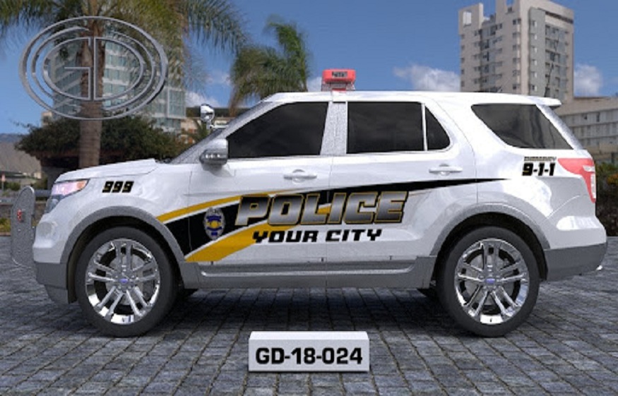
Security Vehicle Graphic Design: Color, Typography, and What They Communicate
Design choices in vehicle graphics carry real weight. Color psychology applies directly to how potential clients perceive your company, often without them realizing it.
Dark color schemes, navy, black, and charcoal, tend to communicate authority, stability, and seriousness. These work well for executive protection, corporate security, and high-end residential clients who want a firm that looks like it means business.
Brighter schemes with high-contrast accents communicate energy and presence, which works well for patrol services, event security, and school or campus environments where visibility is part of the value proposition.
Typography matters just as much. A font that’s clean and legible at speed reads as professional. One that’s decorative, difficult to parse, or inconsistent with the rest of the branding reads as amateur.
If someone can’t read your company name clearly as your vehicle drives past, the impression is already lost. The layout of information also shapes perception. A vehicle with a clear visual hierarchy, company name prominent, contact information accessible, certification marks visible, signals an organized operation. A design that tries to include everything often ends up communicating nothing.
Read More: Impact of Frequent Short Drives on Car Battery Health
The Importance of Fleet Consistency
A single well-designed vehicle makes a good impression. A consistent fleet builds a brand.
When every vehicle in your operation looks like it belongs to the same company, uses the same color scheme, carries the same logo in the same position, and presents the same level of care, clients see infrastructure. They see a company with standards, and that matters in any market where you’re asking someone to trust you with their property or their people.
Inconsistency does the opposite. When vehicles in the same fleet have different logo sizes, different colors, or varying states of wear, the impression is one of disorganization. It raises questions about operational consistency that clients don’t want to be asking before they’ve even made contact.
If your fleet has grown over time and vehicles have been wrapped or lettered at different points, it’s worth auditing what’s out there. Ask yourself what impression a client gets when they see three of your vehicles in the same week and none of them look quite alike.
Patrol Presence as a Sales Tool
Security companies invest in websites, business development staff, and sales calls. Many underinvest in the asset generating the most daily impressions: the vehicles on the road every night.
A patrol vehicle covering a geographic area can be seen by hundreds of people in a single shift. Residents, business owners, property managers, and facility directors are all potential clients or referral sources.
Every drive-by is an opportunity, and the vehicle either earns that opportunity or wastes it.
The companies that understand this treat their fleet as a moving marketing channel. They invest in clean, professional wraps, keep vehicles in good condition, and update the design when their branding changes rather than running outdated graphics for years because it’s convenient.
The return on that investment shows up in inbound leads, referrals, and contract renewals, where clients cite professionalism as a factor in their decision to stay.
What Can a Redesign Actually Change?
If your current vehicle graphics aren’t doing this work for you, a redesign is worth taking seriously, not as a cosmetic exercise, but as a straightforward business decision.
A well-executed rebrand across your fleet aligns your visual presence with the quality of service you actually deliver. It closes the gap between what you offer and how you’re perceived by people who haven’t worked with you yet.
For companies looking to move upmarket, attract higher-value contracts, or expand into new service areas, the vehicle design is one of the first signals the market reads. Upgrading it tells prospects, before a single conversation, that you’re a company that takes every detail seriously.
That message travels every time one of your vehicles leaves the lot.
Get Started on Your Fleet’s First Impression
Begin with an honest audit, and pull photos of every vehicle in your current fleet and look at them side by side. Do they present a consistent, professional brand or a patchwork of design decisions made over the years with no real through-line?
Then think about your ideal client. Property management firms, corporate campuses, residential communities, and event venues each carry different expectations and respond to different visual signals. Your vehicle design should speak directly to the clients you’re trying to win.
Work with a professional wrap company that has experience in fleet branding, not just individual vehicles. The design decisions that make a single vehicle look polished and the ones that make a twenty-vehicle fleet look cohesive aren’t always the same, and getting that distinction right matters.
Your vehicles are out there every night, making impressions on your behalf. Make sure those impressions are the ones you actually want.
Contact Graphic Designs International to work with the experts in law enforcement vehicle graphics.